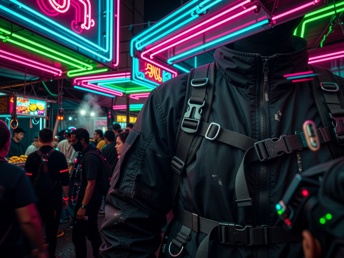
Cyberpunk's visual identity gets treated as decoration more often than any of its other elements, which undersells how deliberately it's constructed. The look didn't accumulate randomly — it grew out of the genre's core argument, that advanced technology and urban poverty sit on top of each other rather than replacing one another, and every recurring visual choice is a way of making that coexistence legible at a glance.
The city: verticality, signage and weather
The archetypal cyberpunk city is read from street level looking up, not from a skyline looking across — verticality that puts corporate power literally overhead, in towers whose upper floors are implied rather than shown. Multilingual signage stacked in dense layers, mixing scripts rather than using a single dominant language, does double duty: it signals a globalised future where economic power has scrambled older national boundaries, and it gives production designers an excuse to fill every surface with light and information without needing any of it to be readable. Rain is doing similarly deliberate work — wet streets multiply every light source through reflection, which is a cheap and reliable way to make a limited number of neon signs read as a saturated, oversaturated environment. None of this is accidental grime; it's a lighting strategy that happens to also carry thematic weight.
Fashion: function first, then silhouette
Cyberpunk style in dress tends to prioritise visible function over decoration — technical fabrics, exposed strapping, layered garments with pockets and harnesses that look load-bearing whether or not they are, asymmetric cuts that suggest modification rather than a finished, symmetrical design. That reads as a translation of the genre's "high-tech-low-life" idea onto a body: expensive materials and construction applied to a garment that still looks improvised, salvaged, or adapted from something with a more utilitarian original purpose, rather than couture in the traditional sense. Colour tends to sit at either extreme — matte black and grey as a base, punctuated by isolated saturated accents in the same cyan-and-magenta range the lighting design favours — rather than a broad, even palette. Practical streetwear influenced by Japanese and Central European utilitarian design has fed this look for decades, less because of any single designer and more because the same functional silhouettes — harnesses, technical outerwear, boots built for movement — keep getting rediscovered as visually "future-coded" independent of any specific brand.
Surfaces: chrome, holography and the glow
Chrome and reflective surfaces do a specific job in cyberpunk imagery: they turn an object into a mirror for its environment, so a cybernetic limb or a visor doesn't just look advanced, it visibly absorbs and refracts the neon around it, tying the character physically into the lit environment rather than sitting apart from it. Holographic projection — flat, glitching, slightly transparent light rather than solid material — signals information as a physical presence in a scene: an advertisement, an interface or a projected assistant rendered as light you could theoretically walk through. The recurring cyan-and-magenta colour pairing across games, film and print isn't arbitrary either; the two sit at near-opposite points on the colour wheel, which means placed against a dark ground they read as maximally distinct from each other and from the background at the same time, doing a lot of visual work with a minimal palette.
Sound: the genres that share the mood
Cyberpunk's soundtrack tendencies split roughly the way its visuals do. Synthwave and darksynth lean on analogue-style synthesizer tones and steady, driving rhythms that evoke 1980s film scoring without literally reproducing it, giving scenes a nostalgic-future quality that matches neon signage's mix of old and new. Industrial and EBM (electronic body music) bring harsher, more mechanical percussion and distorted vocal treatments, better suited to the genre's uglier, more oppressive corporate-control moments than its neon-lit night-market ones. Which register a given scene reaches for tends to track the same high-tech-low-life split as the visuals: the more mechanical, industrial end of the sound palette shows up where control and surveillance are the point, and the more melodic synthwave end shows up where the city is being presented as alluring rather than threatening.
Reading the aesthetic as argument, not just mood
Treating all of this as pure mood-boarding misses what it's for: every element described here is a compressed way of restating the genre's core claim that dazzling technology and grinding inequality are the same picture, not two separate ones layered on top of each other. A scene that shows chrome and rain without ever showing who can't afford either isn't really working in the tradition — it's borrowing the look without the argument underneath it.